
Walk into any museum housing Mark Rothko paintings, and you will experience something no photograph can capture. The canvases seem to breathe. Colors float in atmospheric space. Light appears to emanate from within the work itself.
This luminous quality disappears entirely in flat prints. The reason lies not in color accuracy or resolution. It stems from the fundamental difference between printed ink and layered oil paint.
Understanding this distinction matters for anyone seeking to bring Rothko's transcendent experience into their living space. This article explores the technical chemistry, materials, and craftsmanship that separate authentic hand-painted Rothko studies from mass-produced prints.
The Chromatic Vision: How Mark Rothko Conceived Luminous Color Fields
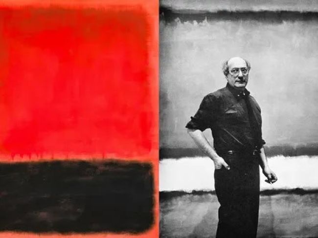
Mark Rothko spent his career pursuing a singular goal. He wanted viewers to have profound emotional and spiritual experiences through color alone. His work eliminated recognizable forms and shapes entirely by the late 1940s.
What remained were floating rectangles of color that seemed to hover in undefined space. These compositions invited prolonged contemplation. The artist famously preferred viewers to stand close to his large canvases.
This proximity allowed the work to fill one's entire field of vision. At such distances, the subtle variations in tone and texture became apparent. The painting transformed from object into immersive environment.
Rothko achieved this effect through meticulous technique. He built his surfaces through dozens of thin paint applications. Each layer modified the optical qualities of those beneath it.

Close-up detail of Rothko color field painting showing layered brushwork
The resulting surfaces possess remarkable depth despite appearing flat from a distance. Light penetrates the translucent layers, reflects off the canvas background, and travels back through the paint film. This creates an internal glow impossible to replicate through surface printing.
His working method evolved throughout his career. Early works featured more gestural brushwork. Later paintings demonstrated increasing restraint and refinement in application.
By the 1960s, Rothko had perfected his approach to creating what he called "unknown adventures in unknown space." These adventures depended entirely on the physical properties of layered paint and the viewer's direct experience with the actual painting surface.
The Fundamental Problem: Why Prints Fail to Capture Rothko's Atmospheric Depth

Side-by-side comparison of glossy print versus matte hand-painted canvas texture
A print reproduces an image of a painting. It does not reproduce the painting itself. This distinction proves critical when considering color field work where the physical paint surface creates the artistic experience.
Commercial printing applies ink to paper or canvas in a single pass. The result sits entirely on the surface. No matter how accurate the color matching, the print remains fundamentally two-dimensional.
Surface Reflection Destroys the Viewing Experience
Most prints exhibit what conservators call "plastic gloss." The ink layer creates a reflective surface that bounces ambient light directly back to the viewer. This reflection competes with the image itself.
In a Rothko work, you want light to enter the paint layers. Surface gloss prevents this penetration. The image becomes a mirror rather than a window.
Characteristics of Printed Reproductions
- Single ink layer applied to surface
- Glossy or semi-glossy finish
- Flat optical depth
- Uniform surface texture
- Light reflects rather than penetrates
- Colors appear static and dead
Characteristics of Hand-Painted Studies
- Multiple translucent paint layers
- Dead matte finish without gloss
- Dimensional optical depth
- Varied surface texture from brushwork
- Light penetrates and reflects internally
- Colors appear luminous and alive
Color Gamut Limitations in Print Technology

Color gamut diagram showing oil paint versus CMYK print color range
Standard CMYK printing cannot reproduce the full spectrum of colors available in oil paint. This matters especially for Rothko, who worked extensively with deep maroons, rich oranges, and complex earth tones.
These colors fall outside the CMYK gamut. Printers compensate by substituting the closest available alternative. The result approximates but never matches the original color intensity.
Even high-end giclée printing faces these limitations. While offering broader color range than offset printing, it still cannot capture the chromatic vibration created by overlaid translucent pigments.
Experience the Difference in Person
See how hand-painted studies capture Rothko's luminous depth through authentic glazing techniques. Our comparison gallery demonstrates why texture and layering matter for luxury interiors.
View Hand-Painted Collection
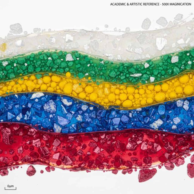
Cross-section diagram showing light penetration through multiple paint layers
Mark Rothko understood paint behavior at a molecular level. His technique exploited the optical properties of thin pigment films suspended in binding media. This knowledge allowed him to create surfaces that manipulate light in specific ways.
The Role of Binding Media in Light Transmission
Rothko frequently mixed oil paint with egg tempera and various thinning agents. This combination created paint with lower viscosity than tube consistency. The thin paint spread easily across canvas while maintaining pigment suspension.
When applied thinly, linseed oil becomes translucent after drying. Light can pass through this film, interact with the layer beneath, and return to the viewer's eye. This process creates optical color mixing distinct from physical pigment mixing.

Laboratory view of oil paint pigments and binding media on glass showing transparency
Each additional layer modifies the optical effect. A warm orange glaze over a red base creates chromatic vibration. The colors seem to shift depending on viewing angle and ambient light conditions.
Pigment Particle Size and Light Scattering
The artist selected pigments based on their light-scattering properties. Larger pigment particles scatter light differently than finely ground pigments. This affects how matte or luminous a dried paint film appears.
Rothko preferred pigments that created matte surfaces. His finished paintings absorb rather than reflect ambient light. This absorption draws viewers into the work rather than pushing them away with surface glare.
Oil Paint Properties That Create Depth
- Translucent binding media allows light penetration
- Pigment particles suspended in oil film
- Each layer modifies optical qualities of previous layers
- Drying process creates micro-texture variations
- Matte finish absorbs and diffuses light
The Chemical Process of Paint Film Formation
Oil paint does not dry through evaporation like acrylic or watercolor. It cures through oxidation. Oxygen molecules bond with the oil, creating a solid polymer film.
This process takes months to complete fully. During curing, the paint film undergoes subtle changes in transparency and color saturation. Artists must account for this shift when building layers.
Rothko allowed proper drying time between layers. Rushing this process causes adhesion problems and optical muddiness. Patience in building the surface proved essential to achieving his signature glow.
The chemistry of oil paint makes it uniquely suited for creating luminous color fields. No other medium offers the same combination of translucency, workability, and archival stability required for our specialized 30-layer glazing process.
The 30-Layer Glazing Technique: Building Depth Through Patient Application
Creating a faithful hand-painted Rothko study requires understanding his methodical approach to surface building. The process cannot be rushed. Each layer must cure properly before the next application.
Layer Structure from Ground to Final Glaze
The canvas receives multiple layers of preparation before color work begins. Traditional rabbit-skin glue sizing protects fibers from oil absorption. A lean ground coat provides tooth for subsequent layers.
Rothko sometimes tinted his grounds with warm tones. This underpainting influences the final color temperature even when completely covered. The warm base creates a subtle glow that reads as inner light.

Progression showing canvas from bare to finished with multiple glaze layers
The first color applications go down as thin washes. These staining layers sink into the ground, creating the deepest color foundation. Subsequent layers gradually build opacity and chromatic complexity.
Middle layers establish the dominant color fields. These applications vary in translucency. Some areas receive more opaque paint while others remain semi-transparent to allow underlying colors to influence the surface.
Glaze Application Technique for Chromatic Vibration
Final glazes create the characteristic Rothko glow. These ultra-thin applications modify overall color temperature and create subtle gradations within each field. A warm orange glaze over a cooler red base generates visual vibration.
Early Layers (1-10)
- Ground preparation with warm tinting
- Thin staining washes establish base colors
- Color field boundaries defined
- Foundation for optical depth created
Middle Layers (11-20)
- Build opacity in color field shapes
- Adjust color temperature and intensity
- Create soft edge transitions
- Develop spatial relationships
Final Layers (21-30)
- Ultra-thin glazes for chromatic adjustment
- Subtle gradations within fields
- Final matte surface refinement
- Unified atmospheric quality
Drying Requirements
- Minimum 48 hours between applications
- Controlled humidity environment
- Temperature stability during curing
- Total process time: 8-12 weeks

Detail of canvas edge showing multiple paint layer buildup
The technique demands both technical knowledge and aesthetic sensitivity. Each layer must enhance rather than obscure the work beneath. This requires constant evaluation during the building process.
Successful execution produces surfaces that shift subtly with changing light conditions. Morning light reveals different qualities than afternoon illumination. The painting becomes a living presence in the space it occupies.
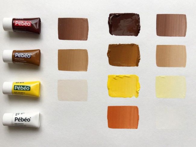
Materials Matter: French Pébéo Oils vs. Mass-Market Alternatives

Tubes of professional Pébéo oil paints with rich pigment samples
Pigment Load and Color Intensity
French Pébéo oils maintain high pigment-to-binder ratios. This concentration delivers intense color from thin applications. Student-grade paints require multiple coats to achieve similar saturation, creating buildup that eliminates the translucent quality essential to Rothko's technique.
High pigment load also ensures better lightfastness. The colors resist fading under normal display conditions. This archival quality matters for work intended to last decades in residential or commercial settings.
Professional Grade Advantages
- Higher pigment concentration per volume
- Superior lightfastness ratings
- Refined linseed oil binders
- Consistent batch-to-batch color matching
- Smooth, even dispersion of pigment particles
- Appropriate drying times for glazing work
Binding Oil Quality and Transparency
Pébéo processes their linseed oil to remove impurities that cause yellowing. This refinement maintains color clarity over time. The oil also demonstrates excellent wetting properties, allowing smooth application without streaking.
The binding medium must remain flexible after curing to prevent cracking. Professional oils balance drying speed with long-term flexibility. This ensures the paint film can withstand normal expansion and contraction of the canvas support.

Close-up of brush loading professional oil paint showing consistency
Color Palette Selection for Hand-painted Rothko studies
Authentic reproduction requires careful color matching to Rothko's preferred palette. His mature work favored deep maroons, earth reds, oranges, and dark grounds. Achieving these specific hues demands mixing skill and quality base pigments.
Certain pigments prove essential: transparent red oxide for earthy warmth, cadmium orange for vibrant accents, burnt sienna for depth, and mars black for grounds. Each pigment contributes unique optical properties to the layering process.
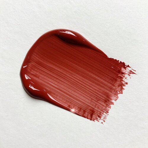
Transparent Red Oxide
Provides the earthy warmth characteristic of Rothko's red paintings. Its transparency allows light to penetrate deeply into the paint layers.
Cadmium Orange
Delivers vibrant warmth for areas requiring visual intensity. Its opacity makes it ideal for middle-layer applications.
Burnt Sienna
Creates depth in darker passages. Excellent glazing pigment that adds warmth without obscuring underlying layers.
The investment in professional materials pays dividends in the final result. Colors remain stable, surfaces develop proper texture, and the overall effect approaches the luminous quality of the original paintings.
Explore Museum-Grade Reproduction Techniques
Our hand-painted Rothko studies use authentic French Pébéo oils and traditional glazing methods. Discover how proper materials and patient technique create the atmospheric depth that flat prints cannot achieve.
View Our Rothko CollectionDead Matte vs. Plastic Gloss: Surface Finish and Viewing Experience

Comparison showing matte painting surface versus glossy print reflection
The surface finish determines how viewers interact with the work. A glossy surface creates a barrier between the viewer and the image. A properly executed matte surface invites visual entry into the color field.
How Surface Reflectance Affects Color Perception
When light hits a glossy surface, much of it bounces directly back at the same angle it arrived. This specular reflection creates bright spots that compete with the image. Your eye focuses on the surface reflection rather than the color beneath.
A matte surface scatters light in multiple directions. This diffuse reflection eliminates hot spots and allows even viewing from various angles. The color appears consistent regardless of your position relative to the canvas.
Glossy Surface Characteristics
- Specular reflection creates hot spots
- Viewing angle severely limited
- Colors appear inconsistent
- Surface glare dominates visual experience
- Photograph-like flatness
- Cheap, mass-produced appearance
Matte Surface Characteristics
- Diffuse reflection eliminates glare
- Wide viewing angle tolerance
- Consistent color appearance
- Draws eye into color fields
- Dimensional depth perception
- Museum-quality presentation

Viewer examining matte Rothko painting in gallery without glare
Achieving Dead Matte Without Compromising Color
Creating a matte finish requires careful attention throughout the painting process. Using paint at appropriate consistency prevents surface sheen. Too much oil in the mix creates gloss when dry.
Some artists add small amounts of wax medium to final layers. This reduces surface shine while maintaining color saturation. The wax must be used sparingly to avoid clouding the paint film.
Alternatively, controlling pigment-to-oil ratio achieves matte surfaces naturally. Paint formulated with just enough binder to hold pigment particles together dries with minimal sheen. This approach requires skill in mixing and application.

Detail showing brush texture on dead matte canvas surface
The Luxury Interior Design Imperative
High-end interior design demands art that enhances rather than distracts. Glossy prints draw attention to themselves as objects. They announce their presence as reproductions.
A properly finished hand-painted study integrates into luxury spaces seamlessly. The matte surface reads as authentic fine art. It commands attention through color and composition rather than surface novelty.
Designers specify matte-finished work because it photographs well without glare. This matters for portfolio documentation and publication. The piece maintains visual integrity under varied lighting conditions.
For residential collectors, the matte surface creates a contemplative viewing experience similar to museum visits. The work invites prolonged engagement rather than quick consumption.
Why Flat Prints Fail in Luxury Interiors: The Atmospheric Depth Requirement

Luxury modern interior with hand-painted Rothko study as focal point
Luxury interiors require art that functions as more than decoration. The work must contribute to the spatial experience. It needs to modify how occupants perceive and feel within the environment.
Creating Spatial Atmosphere Through Color Fields
Large-scale color field paintings alter room perception. They create focal points that organize visual attention. When properly executed with dimensional depth, they generate atmospheric presence.
A flat print occupies wall space but does not engage the surrounding volume. It remains visually inert. Hand-painted work with proper glazing technique projects color into the space through light interaction.
How Dimensional Depth Affects Space
- Luminous surfaces cast subtle color reflection
- Matte finish absorbs harsh light
- Layered paint creates visual weight
- Atmospheric quality softens architecture
- Color temperature influences room mood
- Work commands attention without aggression
Scale Considerations for Maximum Impact
Rothko designed his paintings to be viewed from close distance. This scale relationship proved essential to his conception of viewer engagement. Small reproductions cannot recreate this immersive experience.
Luxury spaces accommodate large-scale work. Properly sized pieces (60x80 inches or larger) allow the color fields to dominate peripheral vision when viewed from conversation distance. This scale creates the intended emotional impact.

Large scale rothko exhibited in perfect lighting
Prints at this scale reveal their limitations dramatically. The flat surface becomes obvious. Color consistency across large areas proves difficult in printing. Hand-painted work maintains luminosity and depth regardless of size.
Integration with Contemporary and Traditional Interiors
Color field abstractions complement both modern and classic design approaches. In contemporary spaces, they provide warmth and humanity that balances minimalist architecture. In traditional settings, they offer sophisticated contrast to ornate details.
Designers value the flexibility of earth-toned Rothko studies. Deep maroons, oranges, and warm browns coordinate with varied color schemes. The neutral backgrounds in many compositions allow them to anchor diverse palette choices.
The matte finish proves essential for this versatility. It prevents the work from clashing with other reflective surfaces in the space. Multiple light sources can illuminate the room without creating distracting glare on the canvas.
Investment Value and Long-Term Satisfaction
Commissioning hand-painted work represents significant investment compared to print purchases. This initial cost differential reflects fundamental quality differences that impact long-term value and satisfaction.
Prints degrade visibly over time. Ink fades under UV exposure. Paper or canvas substrates yellow. The work becomes obviously dated and cheap-looking within years of installation.
Properly executed oil paintings maintain appearance for decades. Museum conservation studies demonstrate that quality oil paint remains stable for centuries under normal indoor conditions. The work appreciates in perceived value as it ages.
Commission Museum-Quality Rothko Studies for Your Space
Our hand-painted reproductions bring Rothko's transcendent color experience to luxury residential and commercial interiors. Each piece is created using our specialized 30-layer glazing process with French Pébéo oils.
Request ConsultationThe Irreplaceable Value of Hand-Painted Rothko Studies

The Irreplaceable Value of Hand-Painted Rothko Studies
The difference between a print and a hand-painted study extends beyond simple quality gradations. These represent fundamentally different categories of objects serving distinct purposes.
A print provides visual reference to a famous composition. It decorates wall space economically. These legitimate functions serve certain needs and budgets appropriately.
A hand-painted study recreates the viewing experience of the original work. It captures the optical phenomena that made Rothko's paintings significant. This recreation demands proper materials, technique, and time investment.
For those seeking to bring authentic art experience into their living and working environments, understanding these technical distinctions proves essential. The luminous depth, chromatic vibration, and atmospheric presence of layered oil paint cannot be achieved through surface printing.
The investment in hand-painted work reflects recognition that art functions as more than decoration. It acknowledges that the physical properties of paint, canvas, and technique create experiences that profoundly affect how we inhabit space.

Person experiencing hand-painted Rothko study in contemplative museum setting
Mark Rothko spent his career refining techniques that allowed color to create transcendent emotional experiences. Honoring that vision requires reproduction methods that preserve the essential physical qualities of his work. Only patient glazing with quality materials achieves this goal.
The choice between flat prints and hand-painted studies ultimately reflects what you value in art. If the goal is simply recognizable imagery on the wall, prints suffice. If the objective is recreating Rothko's luminous, contemplative presence, only authentic painting technique succeeds.